A step-by-step guide to the UI/UX design process: research, defining problems, information architecture, wireframes, visual design, prototyping, testing and developer handoff.
In this article
- 01Why a structured design process matters
- 02Step 1: Research users and context
- 03Step 2: Define the problems to solve
- 04Step 3: Information architecture and user flows
- 05Step 4: Wireframes
- 06Step 5: Visual design and the design system
- 07Step 6: Prototyping
- 08Step 7: Usability testing and iteration
- 09Step 8: Developer handoff and support
- 10Working with stakeholders throughout
- 11Common mistakes in the design process
- 12Step 9: Measure and improve after launch
Why a structured design process matters
Good digital products rarely come from jumping straight into visual design. They come from understanding users, defining the right problems, exploring solutions, testing them with real people and handing clear specifications to developers. A structured process reduces rework, aligns stakeholders and produces interfaces people can actually use.
The steps below describe a typical UI/UX design process for web and mobile products. Teams adapt the depth of each step to project size and risk, but skipping steps entirely usually shows up later as confused users, expensive changes during development or features nobody uses.
Step 1: Research users and context
Design starts with understanding who will use the product, what they are trying to achieve and what gets in their way. User research methods include interviews, observing people at work, reviewing analytics and support tickets, and studying competitor products. Stakeholder interviews capture business goals, constraints and success measures.
Research does not need to be lengthy to be useful. A handful of interviews with real target users often reveals assumptions that would otherwise drive the design in the wrong direction, such as features users never need or tasks the team did not know existed.
- Stakeholder interviews on goals and constraints.
- User interviews and observation sessions.
- Analytics, support tickets and review analysis.
- Competitor and comparable product review.
Step 2: Define the problems to solve
Research produces a lot of information. The define step turns it into clear priorities. Teams create personas or user profiles, map current journeys, identify pain points and write problem statements that describe what users need to achieve. This keeps later design decisions focused on real needs rather than personal preferences.
Success measures belong here too. Agree how you will know the design works, for example faster task completion, fewer support requests or higher conversion, so later testing has clear criteria. Shared, written success measures also help settle disagreements between stakeholders later in the project.
Step 3: Information architecture and user flows
Information architecture organizes content and features so people can find what they need. Card sorting and tree testing help structure navigation around how users think rather than how the organization is structured internally. User flows then map the steps for key tasks, such as signing up, booking an appointment or completing a purchase.
Flows reveal complexity early: unnecessary steps, missing states and decision points that need careful handling. Simplifying a flow on paper is far cheaper than redesigning screens later. Review flows with developers too, since they often spot technical constraints that change the best approach.
Step 4: Wireframes
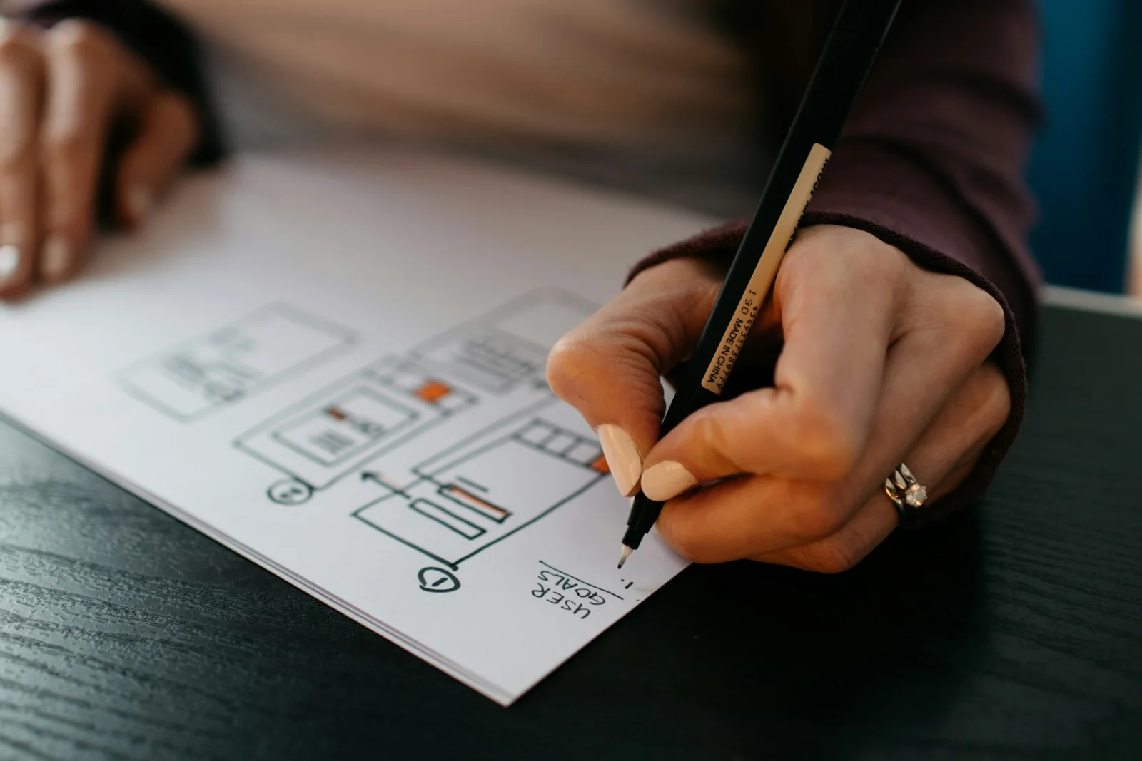
Wireframes are low-fidelity layouts that show structure, content and interactions without visual styling. They allow quick exploration of alternatives and focus feedback on whether the layout supports the task, rather than on colors or fonts. Teams often sketch several options before choosing one direction to develop further.
- Key screens for each priority user flow.
- Empty states, errors and loading states.
- Responsive layouts for mobile and desktop.
- Annotations explaining behavior and rules.
Step 5: Visual design and the design system
Visual design applies brand, typography, color, spacing and imagery to create interfaces that are clear, attractive and accessible. Good visual design guides attention to what matters, communicates status and builds trust. Contrast, text sizes and touch targets should meet accessibility guidelines such as WCAG 2.2 from the start.
A design system collects reusable components, such as buttons, forms, cards and navigation, with rules for how to use them. It keeps the product consistent as it grows and speeds up both design and development, because new features reuse proven building blocks.
Step 6: Prototyping
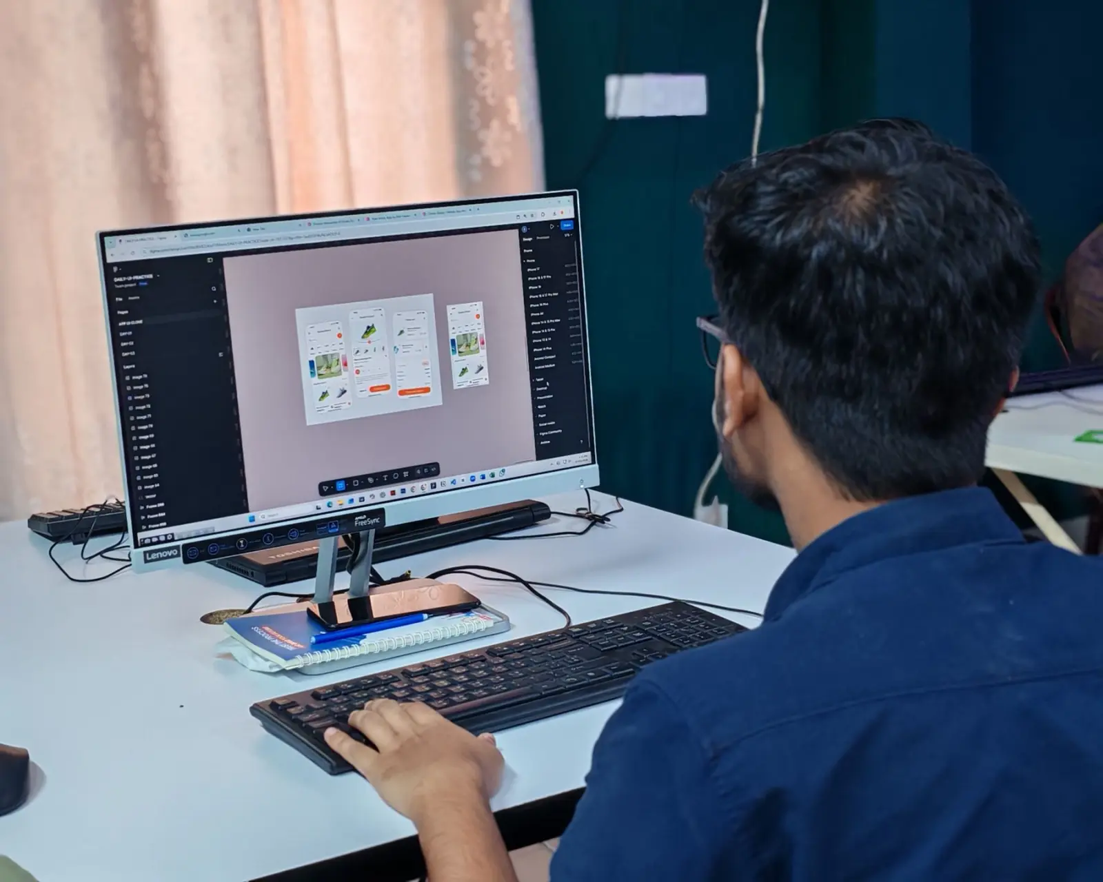
Interactive prototypes connect screens so people can click or tap through realistic tasks. Tools such as Figma make prototypes quick to build and share, and AI-assisted tools can now generate working prototypes from a description for early exploration. Prototypes let stakeholders experience the product before development and provide the material for usability testing with real users.
Step 7: Usability testing and iteration
Usability testing asks representative users to complete tasks with the prototype while the team observes. Watching where people hesitate, misunderstand labels or give up reveals problems that internal reviews miss. A small number of sessions per user group usually uncovers the most important issues.
Findings are prioritized by severity and frequency, designs are revised, and important changes are tested again. Our UX research and usability testing work follows this cycle, because each round makes the design noticeably clearer before any code is written.
- Recruit participants who match target users.
- Write realistic tasks without leading instructions.
- Observe, record and note where people struggle.
- Prioritize fixes and retest key changes.
Step 8: Developer handoff and support
Handoff gives developers everything they need: final designs, specifications, component documentation, interaction details, assets and edge cases. Modern tools let developers inspect measurements and styles directly, but conversations remain essential to clarify intent and technical constraints.
Designers should stay involved during development, reviewing builds and answering questions. Small details often change when real data and technical limitations appear, and quick design input keeps quality high without slowing sprints. Regular design reviews of staging builds catch inconsistencies before release.
Working with stakeholders throughout
Design projects involve many voices: founders, product managers, marketing, sales, support, developers and sometimes legal or compliance teams. Without a clear process for feedback, designs can be pulled in conflicting directions. Agree who makes final decisions, how feedback is collected and which criteria guide choices before design work begins.
Regular reviews at defined milestones, rather than constant ad hoc comments, keep momentum. Presenting research findings and test results alongside designs shifts discussions from personal taste to evidence, which makes decisions faster and less political.
Common mistakes in the design process
The most common mistake is skipping research and testing to save time, then discovering problems during development or after launch, when changes cost far more. Another is polishing visual design too early, before the structure and flows have been validated, which makes teams reluctant to change attractive screens.
Teams also forget edge cases: empty screens for new users, error messages, slow connections, long names and accessibility needs. Designing these states up front prevents inconsistent improvisation by developers and produces a more trustworthy product for every user.
- Skipping user research and usability testing.
- Polishing visuals before validating structure.
- Ignoring empty, error and loading states.
- Treating accessibility as an afterthought.
Step 9: Measure and improve after launch
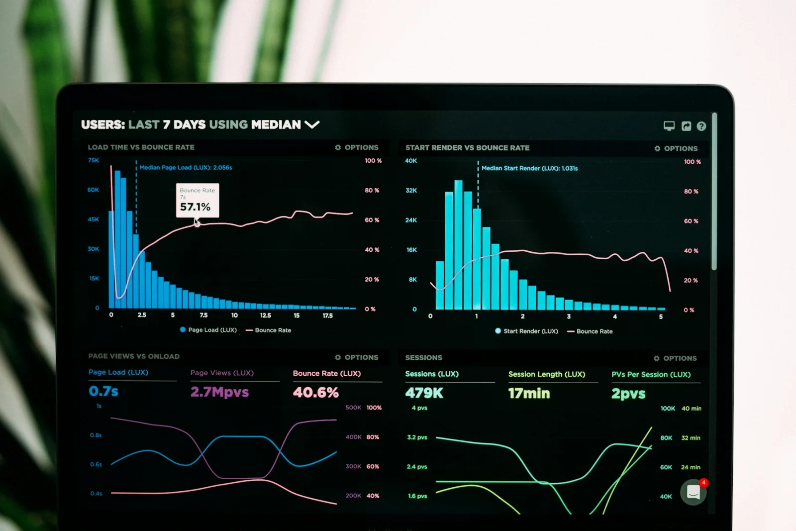
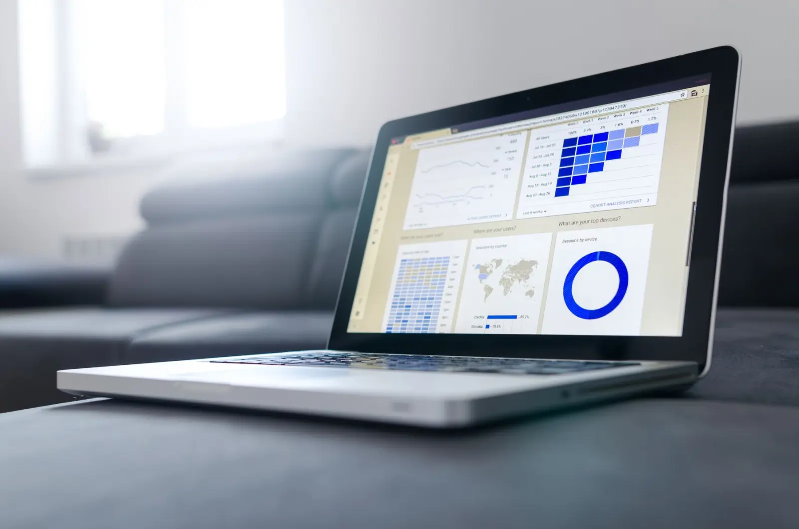
Design does not end at launch. Analytics, user feedback, support tickets and further testing show how the product performs in real use. Teams then prioritize improvements, run experiments and evolve the design system. Our UI/UX design team supports this full cycle, including for clients in markets such as the UAE, where bilingual and right-to-left layouts add further design considerations.